Hello, World! 👋
Table Of Contents
- Why this website?
- What kind of features I want in website?
- So about the tech stack..
- Layout
- The Desktop View
- The Mobile View
- Pages
- 🏠 Home
- 📙 Blog
- 📒 Snippets
- 🔦 Uses
- Features
- 🌟 Branding..
- 📝 Content Collections
- 🟢 Discord Status - Lanyard
- 🔍 Command Palette
- ⚙️ Settings
- 🚇 View Transitions
- 🧑💻 Code Highlighting
- 🧭 Navigation Indicators
- 🎨 Themes
- 🔊 Sounds
- 🌐 SEO
- Seems like all features are done- NO!
- Result
Why this website?
I’ve wanted to create this website for a very long time. Back in 2022, I wondered what I would do with a website if I ever built one for myself. I’ve always loved journaling in large notebooks or private digital applications, but I also wanted a personal digital space where I could share my thoughts, tutorials, and interests with my friends on the internet (or for myself in future).
It took me some time to streamline my ideas for the website without going beyond my scope. In 2023, I began researching how personal blogs and websites are managed effortlessly and sought a suitable tech stack to work with. I needed an easier way to handle a large amount of content. Most websites tend to be heavily interactive; I was looking for the perfect balance.
What kind of features I want in website?
- Creating a cozy, modern, minimalist website.
- Using intuitive icons for blogs, settings, and navigation.
- Minimalist settings for themes, sounds, and layout.
- Command palette for quick access.
- Displaying Discord activity on the site.
So about the tech stack..
Since this is my personal website and project, I wanted to try something that’s quite trendy and for the right reasons. Here are the important tools and dependencies:
There are a few more dependencies based on the above-mentioned tools and dependencies. I will discuss these in each section.
Layout
From the beginning, I wanted to create a cozy website with a two-layout sidebar for the desktop view and a bottom-bar navigation for mobile view. As a result, I spent a considerable amount of time prototyping it.
The Desktop View
- Desktop view has a left sidebar with navigation links.
- A footer is present at the end of the sidebar.
- A Command Bar is at the top of the main content for productivity that includes the Command Palette and Settings.
The Mobile View
- Mobile view has a bottom bar for navigation.
- Special menu button opens more links and settings.
- Designed for easy reading with one-thumb scrolling.
- Simplified Command Bar in the menu bar only.
Pages
I’m listing the pages I want on my website and discussing how I addressed any issues I encountered.
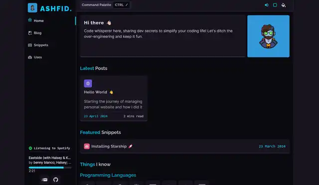
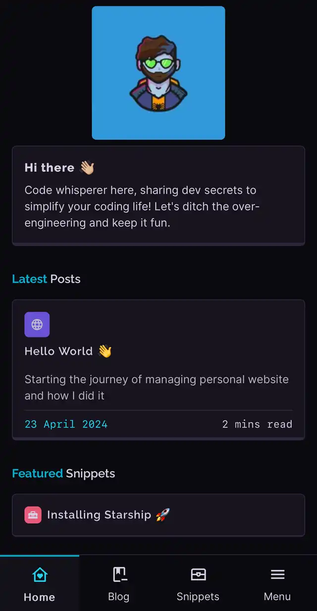
🏠 Home
- Simple introduction to important pages and a bit about me.
- Happy with current setup: hero section, latest blog posts, snippets, and skills.
- Future plans: add side projects and favorite bookmarks.
📙 Blog
Also, you are reading this blog currently 😈
- Repository for lengthy writings with categorized and tagged posts.
- Happy with current setup: blog cards, sorted posts by year, and color-coded categories.
- Future plans: improve filtering options and add reaction feature to each post.
Astro’s Content Collections makes it very easy to create posts and have image optimization at build time. Easily the best feature of any framework till now.
📒 Snippets
- Collection of small codes, tips/tricks, and tool installations.
- Happy with: snippet cards, sorted posts by year, and color-coded categories.
- Future plans: enhance filtering options similar to the blog page.
🔦 Uses
- Showcases tools used for projects or productivity, well-categorized.
- Happy with: transitions, categories, and tool icons.
- Future plans: enable one-click installs for each tool.
Features
Interactive/non-interactive features were created specifically for this website. I’ll discuss the struggles I encountered and what I aim to improve.
🌟 Branding..
For a long time during the development phase, I was using a picture created by Kostur, and I really liked it. I was content with it. I love his minimalistic artistic take on it. I will always use it for Discord. Thank you, Kostur!
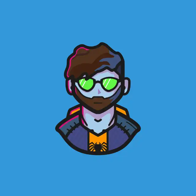
However, I wanted a more cozy logo in general. My wife started making pixel art this year and began drawing me in various ways. She enjoyed doing it, and we ended up loving this one. It fits the color schemes and vibes of this website better, and I am happier with it.
Oh by the way, hover over the sprite - it’s animated too 🥳.
This is just the starting of many animations for the sprite. There will be more animations doing different kind of activities for more context on each page.
📝 Content Collections
Astro’s content collections is the best way to write content with markdown. It can be used as database for your categories and posts. It makes referencing each collection so much easier and type-safe.
How to start?
- Create astro project.
- Create a folder called
contentinsrcfolder. - Add a
config.ts - Make your own collection schema (example for blog post) and export them:
src/content/config.ts import { z, defineCollection } from 'astro:content'const blogCollection = defineCollection({type: 'content',schema: z.object({title: z.string().max(60),description: z.string().max(160),published_time: z.date(),last_modified_time: z.date().optional(),tags: z.array(z.string())})})export const collections = {blog: blogCollection,} - Create a folder called
blogincontentfolder created above. - Create new markdown files with same schema as above.
---title: Testing Postdescription: Testing Descriptionpublished_time: 2024-04-03last_modified_time: 2024-05-05tags:- svelte- astro- website- programming---
- Query those markdown files using
getCollectionfunction exported by ‘astro:content’ and render them!---import { getCollection } from 'astro:content'const posts = await getCollection('blog')---{posts.map(async post => {const { Content } = await post.render()return <p>{post.title} <Content/></p>})}
Head to Astro’s Content Collection for more information
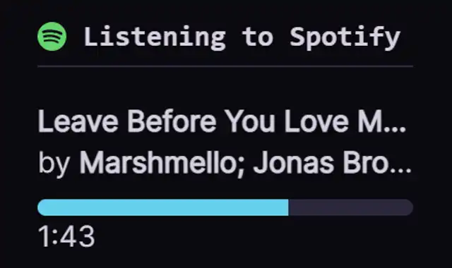
🟢 Discord Status - Lanyard
I wanted to display my Discord activity or any digital activity I’m doing, like playing games or listening to Spotify. I found a great app by Phineas called Lanyard. Thanks to Nuro that mentioned this application, it was great read about it.
In short, you join Lanyard’s Discord server and make sure the activity status privacy is turned on. Then, you get your Discord’s developer ID and use it to connect to Lanyard’s websocket server or REST API. To make things easier, I used svelte-lanyard and entered my Discord account’s developer ID. It shows your current activity with lots of details.
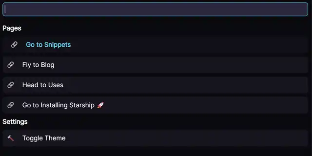
🔍 Command Palette
I’m a big fan of command palettes in editors like Visual Studio Code. They make navigating through files and settings a breeze, and finding what you need is usually a one-shot deal.
Creating such a feature, however, is complex, mainly due to accessibility and behavioral considerations.
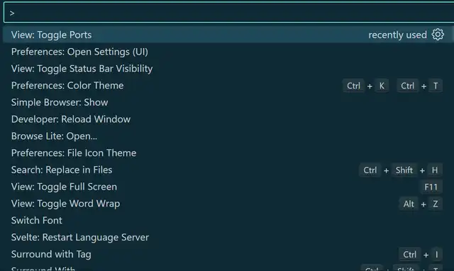
Like any other front-end developer, I searched for packages to help me out. Surprisingly, all I needed was a robust fuzzy search package—enter Fuse.js, the ultimate JS library for fuzzy search.
Now, let’s talk challenges:
- Trapping tab focus within the palette for better accessibility.
- Enabling storage of commands via any external component.
- Making the palette keyboard-responsive.
- Assigning unique IDs to each command button without disrupting search order.
- Grouping search results into sections post-search, which proved tricky and still needs refinement.
- Keeping the input focused while changing selected commands with the arrow keys.
Despite these hurdles, the palette is now deployable. Improving command addition implementation remains on the to-do list for another day.
⚙️ Settings
I had to prototype the settings menu in many styles, but I was not satisfied. I was content with the dropdown settings menu for a long time. However, I never really felt it was a part of my website, even though it functioned well. I didn’t take it that seriously until I desired a more minimalistic approach, with icons for settings.
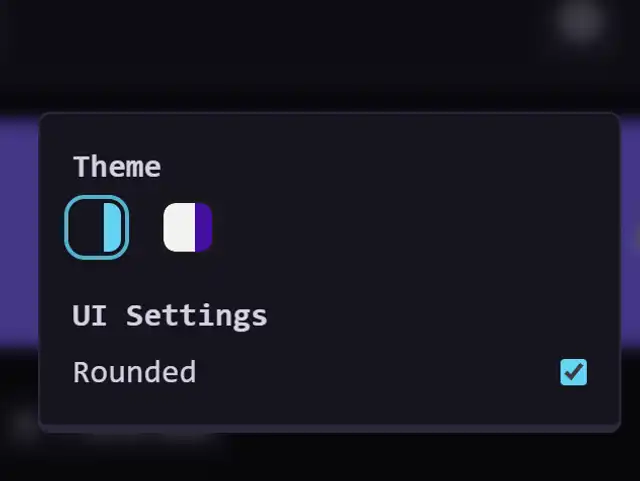
The new menu settings reside on the command bar of the desktop view or at the top of the menu in the mobile view. It’s straightforward and no-nonsense so far. I’m very pleased with it now because I can move this component around and still be satisfied with it.
My Struggles:
- Creating a reusable settings store.
- Bundling different code themes with actual themes. I solved this by creating a small database containing all the themes and their respective code themes.
I still have 2-3 settings to create. So far, flipping the layout and providing dyslexia support for fonts come to mind.
🚇 View Transitions
I fell in love with the ‘whole view transitions’ video released by Google, which allows for native-like application transitions from page to page. I wanted to incorporate this into my website. By the time I started building my site, Astro had added view transitions as a feature for Chromium browsers, with a fallback for non-Chromium browsers.
I considered adding a GIF to demonstrate it, but it’s best experienced firsthand. It’s most noticeable on the Uses page when you switch categories, or anytime you navigate from the home page to the blog or snippets. It ensures that pages morph with a fade, which is the default transition.
My Struggles:
- Knowing what element should morph without motion sickness.
- Theme toggles.
🧑💻 Code Highlighting
Developer websites without any code highlighting? That’s impossible. I found expressive-code, which is heavily used by Astro’s own Starlight documentation template. It has almost all the features of an IDE and includes great plugins. Plus, VSCode themes can also be used with it 🎊!
public void Test(){ String message = "Hello World"; Console.WriteLine(message);}Expressive Code also got multi-theme support. It’s very important featureset for me. Expressive Code is built on Shiki highlighter.
🧭 Navigation Indicators
Navigation indicators are essential for the currently active page, with accessibility in mind, using the aria-current attribute. I also added small indicators for pages that take time to load - this was trickier, but very fun to implement. Working with Astro’s view transitions API and client-side routing is a joy.
The mobile view also has indicators, just without any for loading.
OH, links got sounds too! 🕺
🎨 Themes
I want to add more themes to the list than just dark and light theme. I am okay with the variables I created for this site. My aim to make 6 distinct themes in total this year at least with accessibility in mind.
I am using tailwind to place these tokens all over the components but css variables are my starting point for any design system.
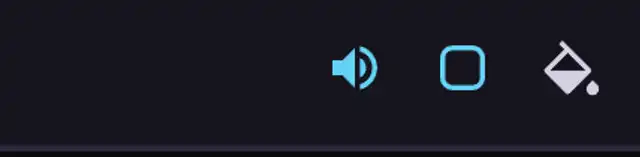
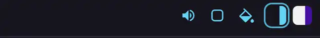
🔊 Sounds
I added basic sounds to navigation links that activate when the user interacts with them. I still want to add different types of sounds to different buttons.
It works great with the sound toggle too.
🌐 SEO
SEO is very important for any post or website to get indexed. I am working very heavily on the SEO. Open Graph tags make it very easy to do. Here’s my seo component that works on every page and article, easy to extend or customize:
// Basic tags<title>{title}</title><meta name="description" content={description} />
// Open Graph Tags<meta property="og:type" content={type} /><meta property="og:url" content={Astro.url.href} /><meta property="og:title" content={title} /><meta property="og:description" content={description} /><meta property="og:image" content={urlImage} /><meta property="og:image:width" content="960" /><meta property="og:image:height" content="960" />
// Article Open Graph Tags<meta property="article:published_time" content={published_date.toDateString()} /><meta property="article:tag" content={tags.join(', ')} />
// Twitter Tags<meta property="twitter:card" content="summary_large_image" /><meta property="twitter:url" content={Astro.url.href} /><meta property="twitter:title" content={title} /><meta property="twitter:description" content={description} /><meta property="twitter:image" content={urlImage} />
Seems like all features are done- NO!
Important features are done but many accessibility is still not consistent.
- Little bugs will be present.
- Even though view transitions API got reduced motion built in, I still wanted it to be a css variable to toggle.
- Color contrasts needs to be better.
- Make some more components more robust.
- Types for some variables needs to be more robust.
- Background patterns.
- Reduced motions for transitions
The points above are not in order. But it’s very important for me to implement them very soon.
Result
Well, the result is this very website. Support me by just looking around the website or by forgetting me in your bookmarks page (if I even get there) 🎊!
Thank you for reading this long post! 💖